hello!


My name is Marie horton, i’m a Graphic designer and 2d motion design artist, snake mom, and cat lover.
I grew up in the southern US and currently reside in Tennessee with my cat Jester and ball python Sehanine (for all you DnD fans out there!)
I love a good fantasy novel, traveling to far away places, film, fashion, and vintage shopping.
Graphic Design
*
Graphic Design *
Logos


Packaging & Mockups


Layouts


branding
*
branding *
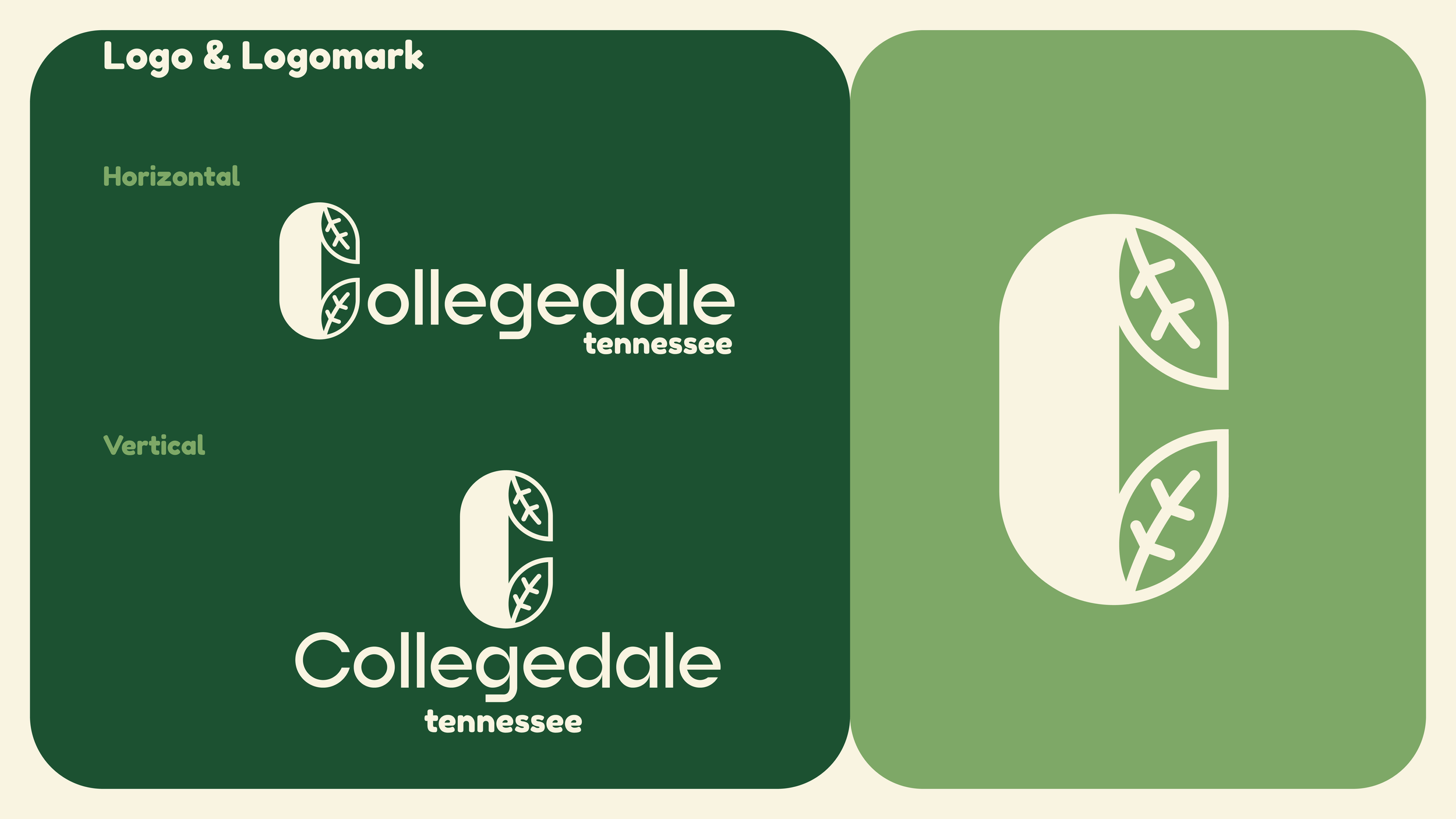
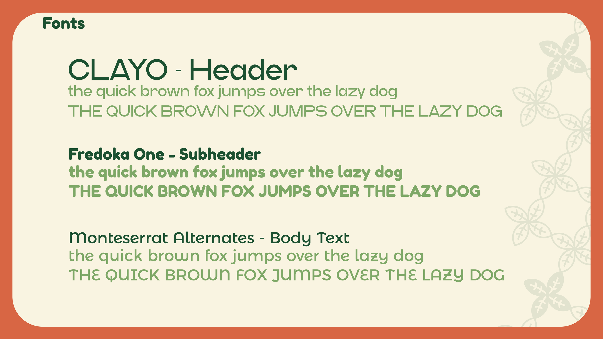
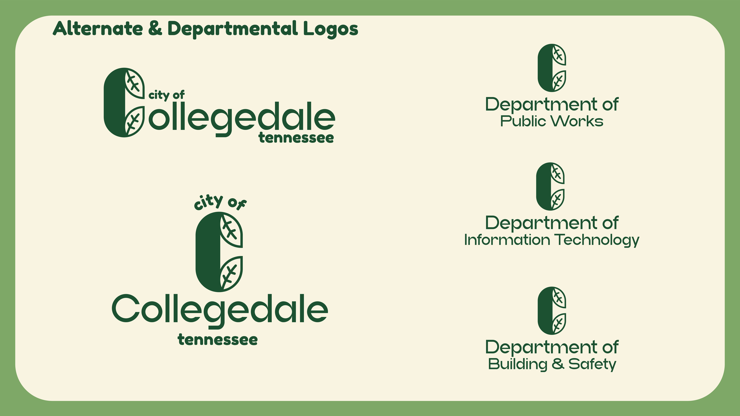
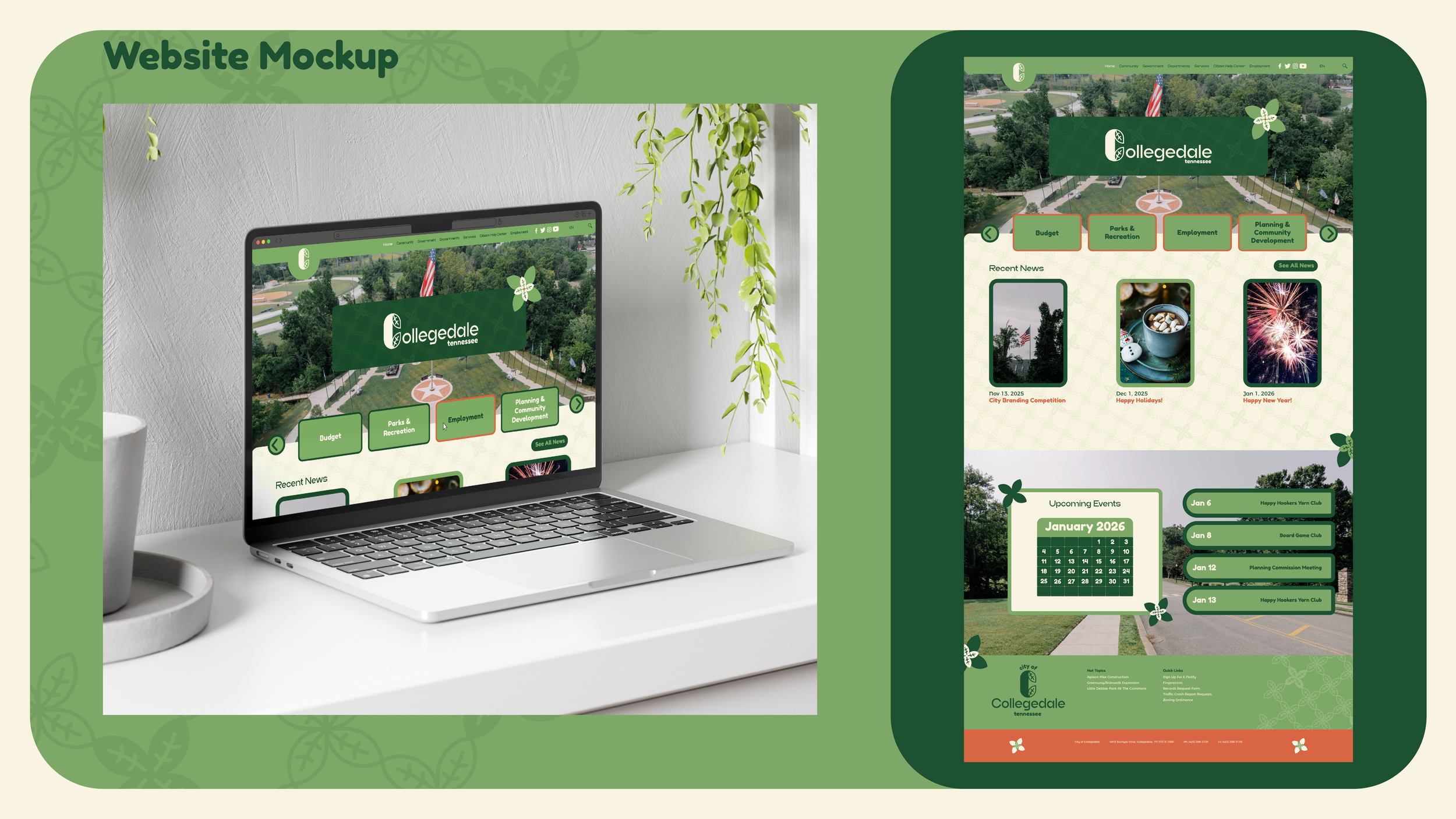
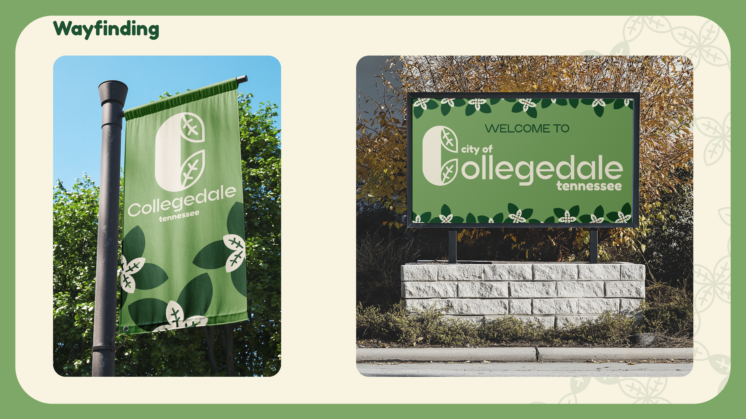
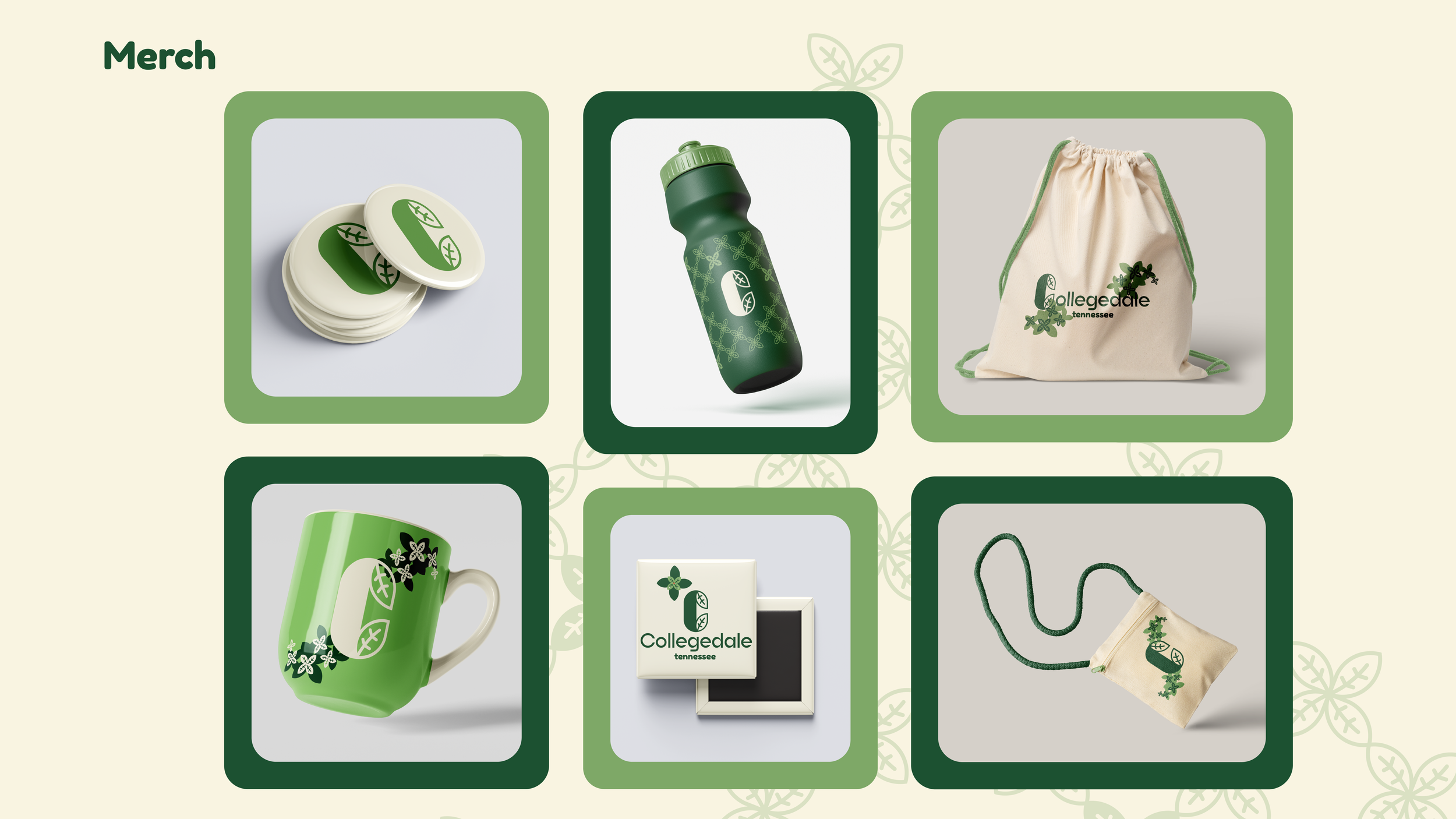
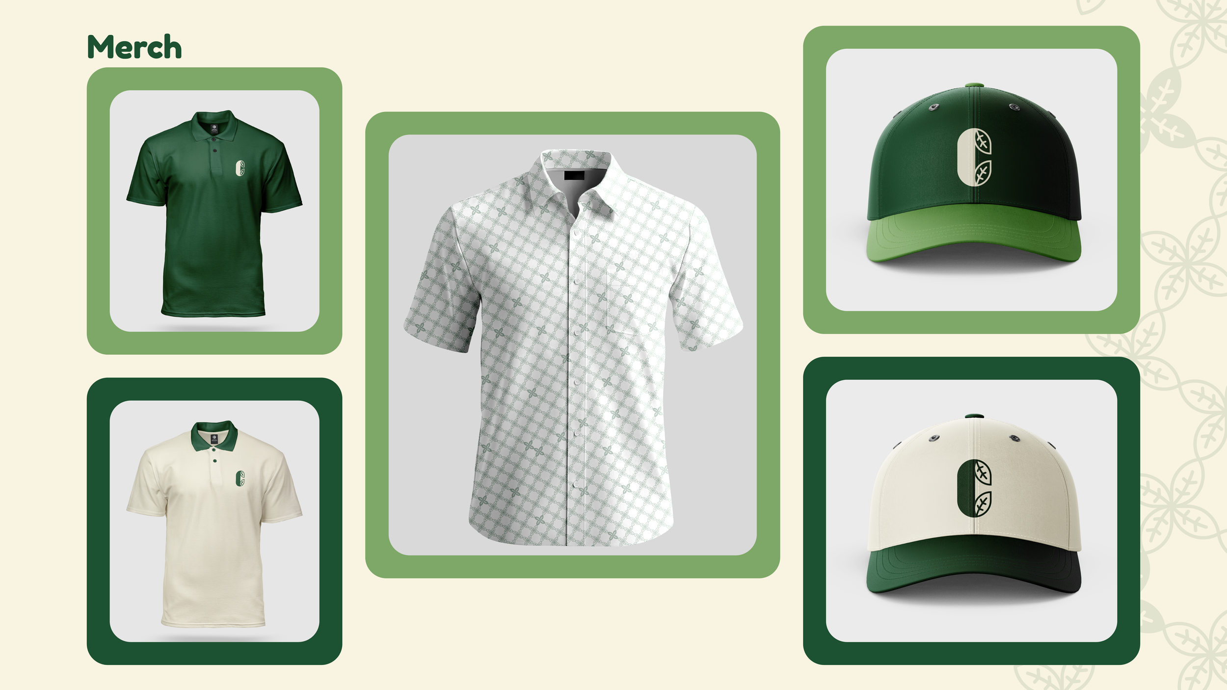
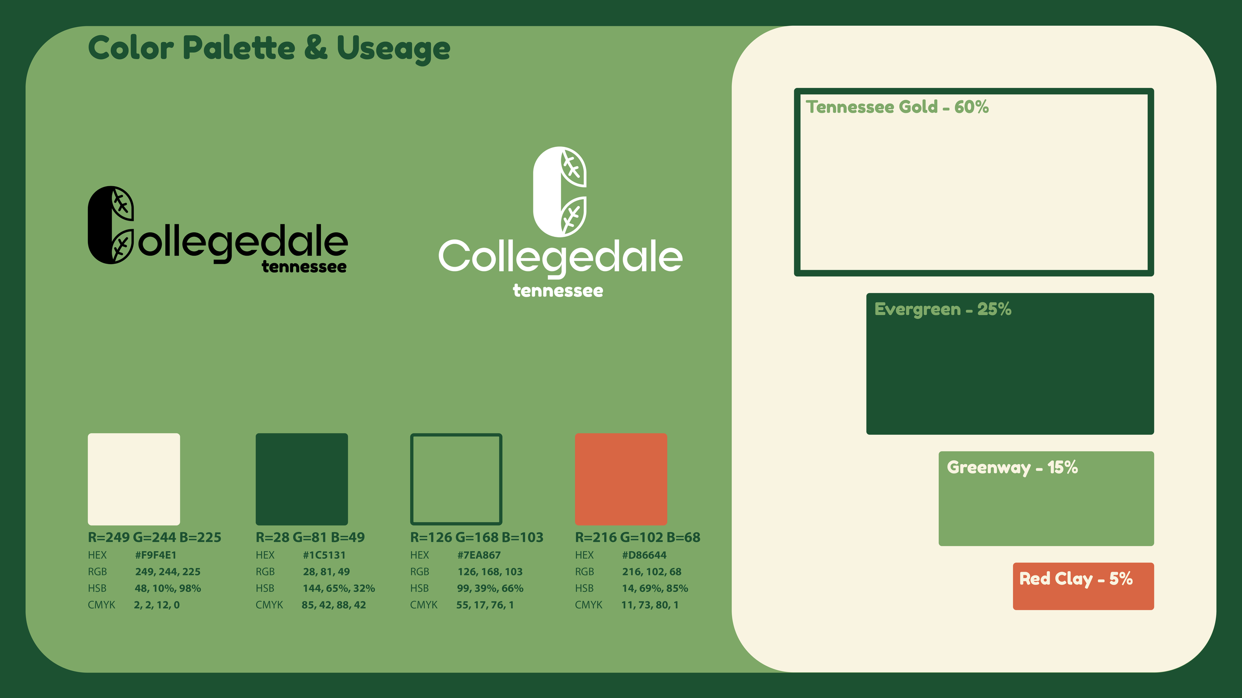
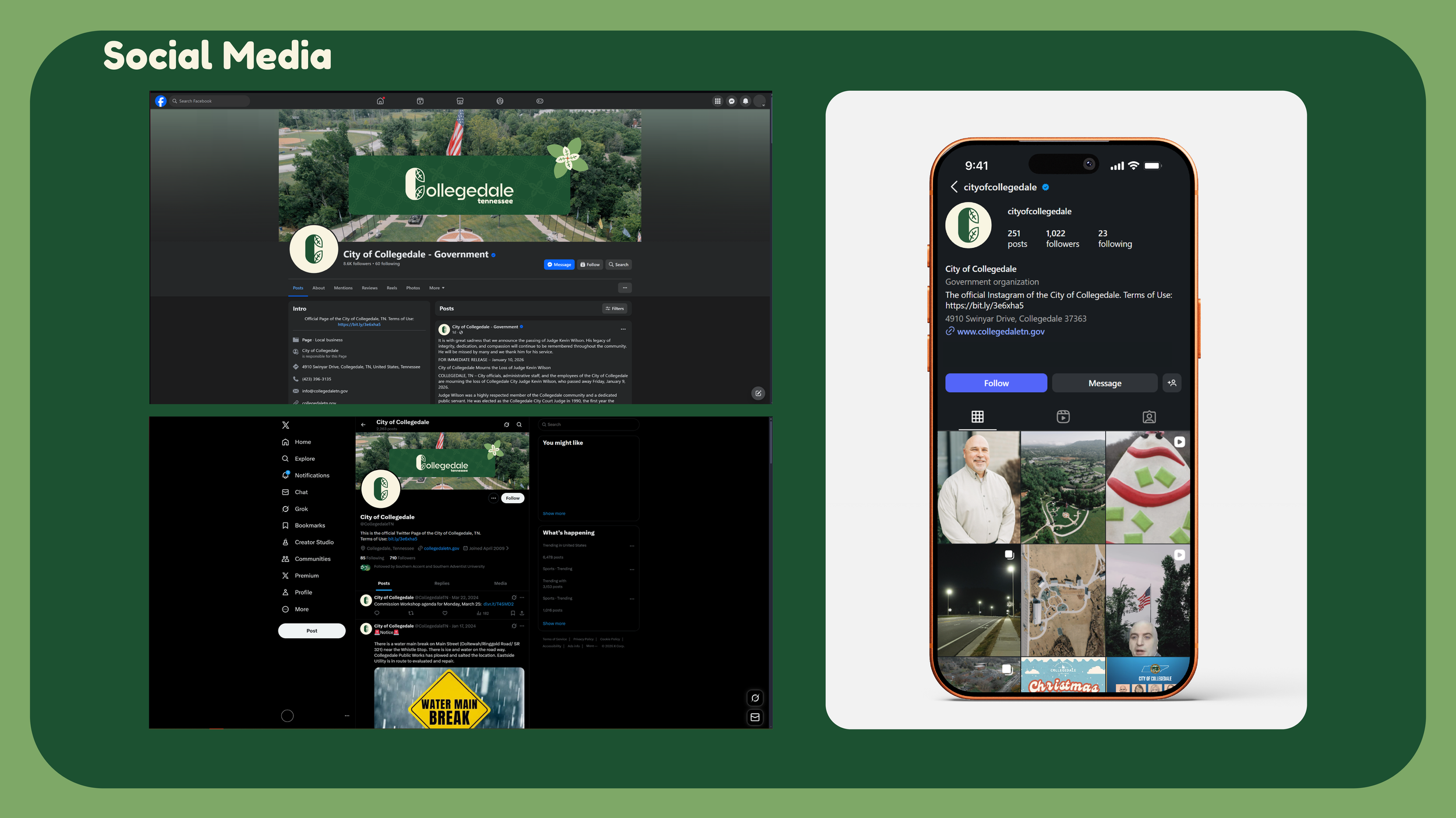
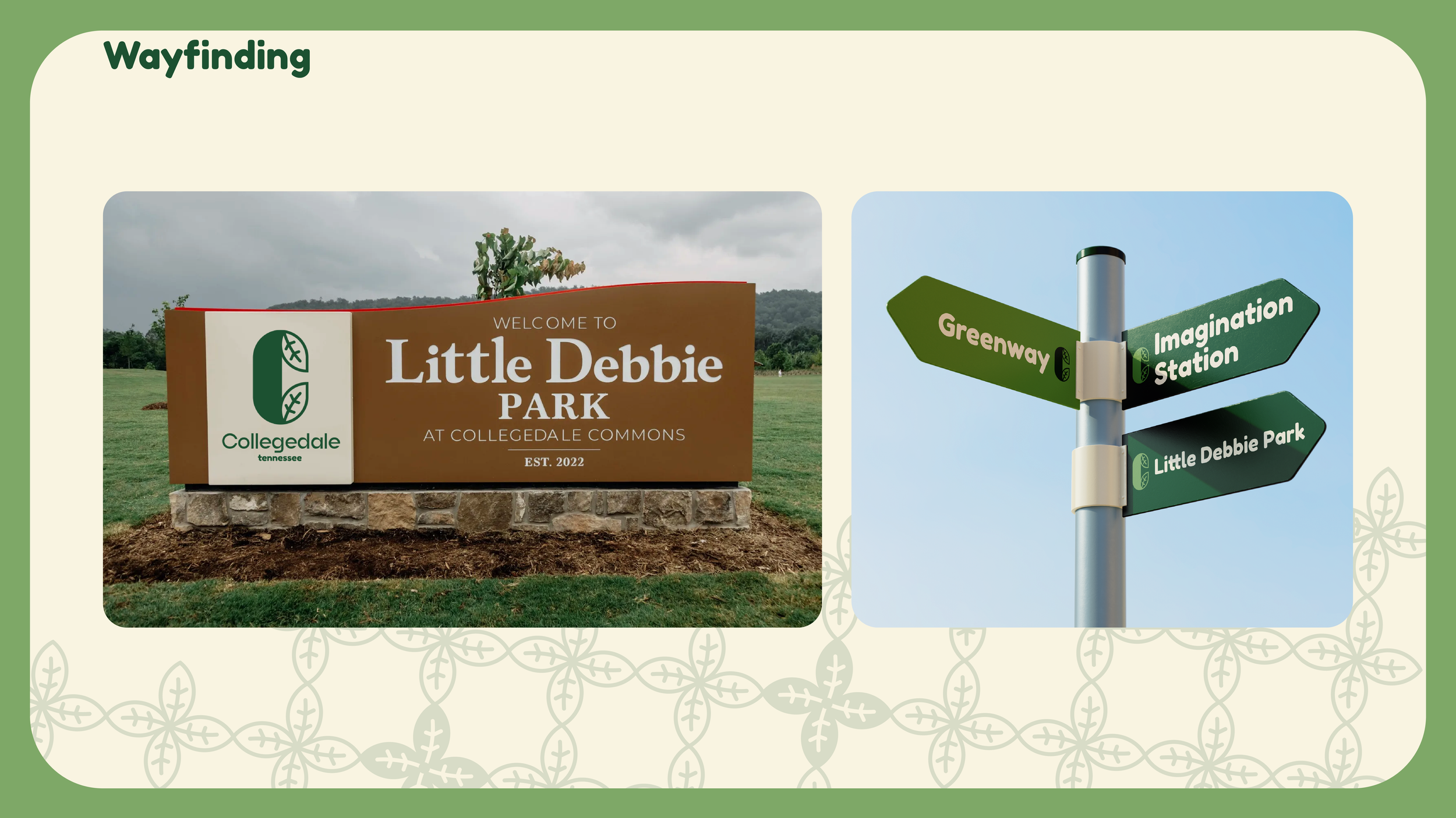
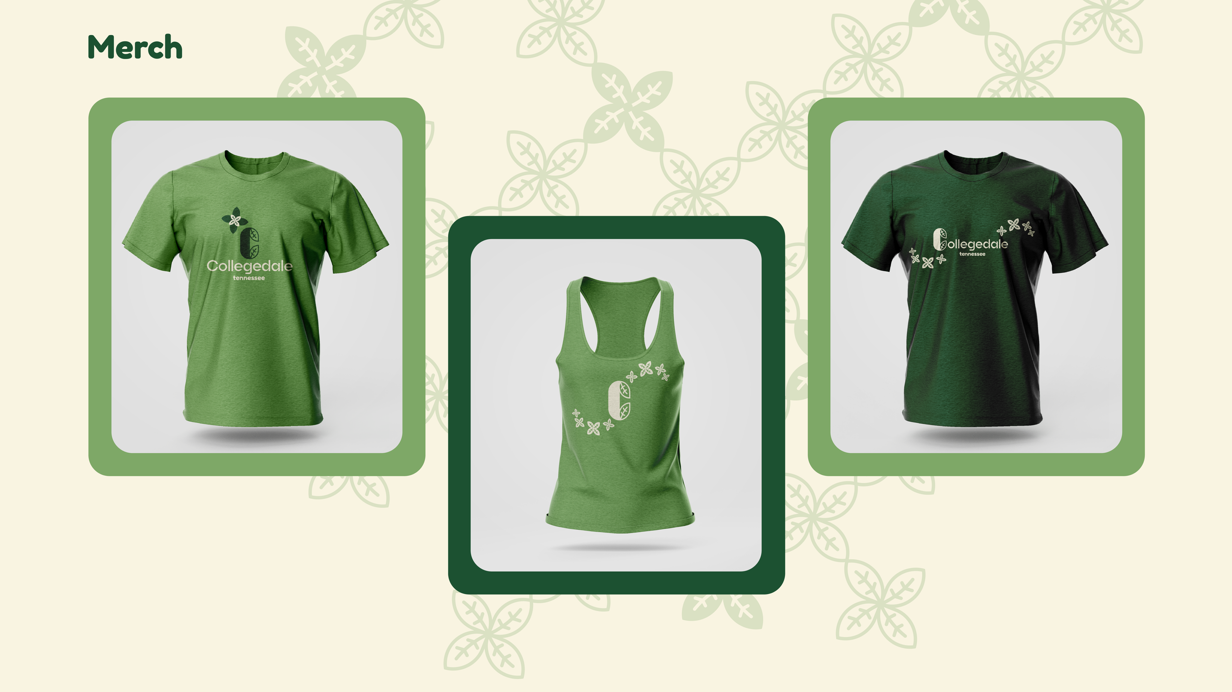
Collegedale City Rebrand
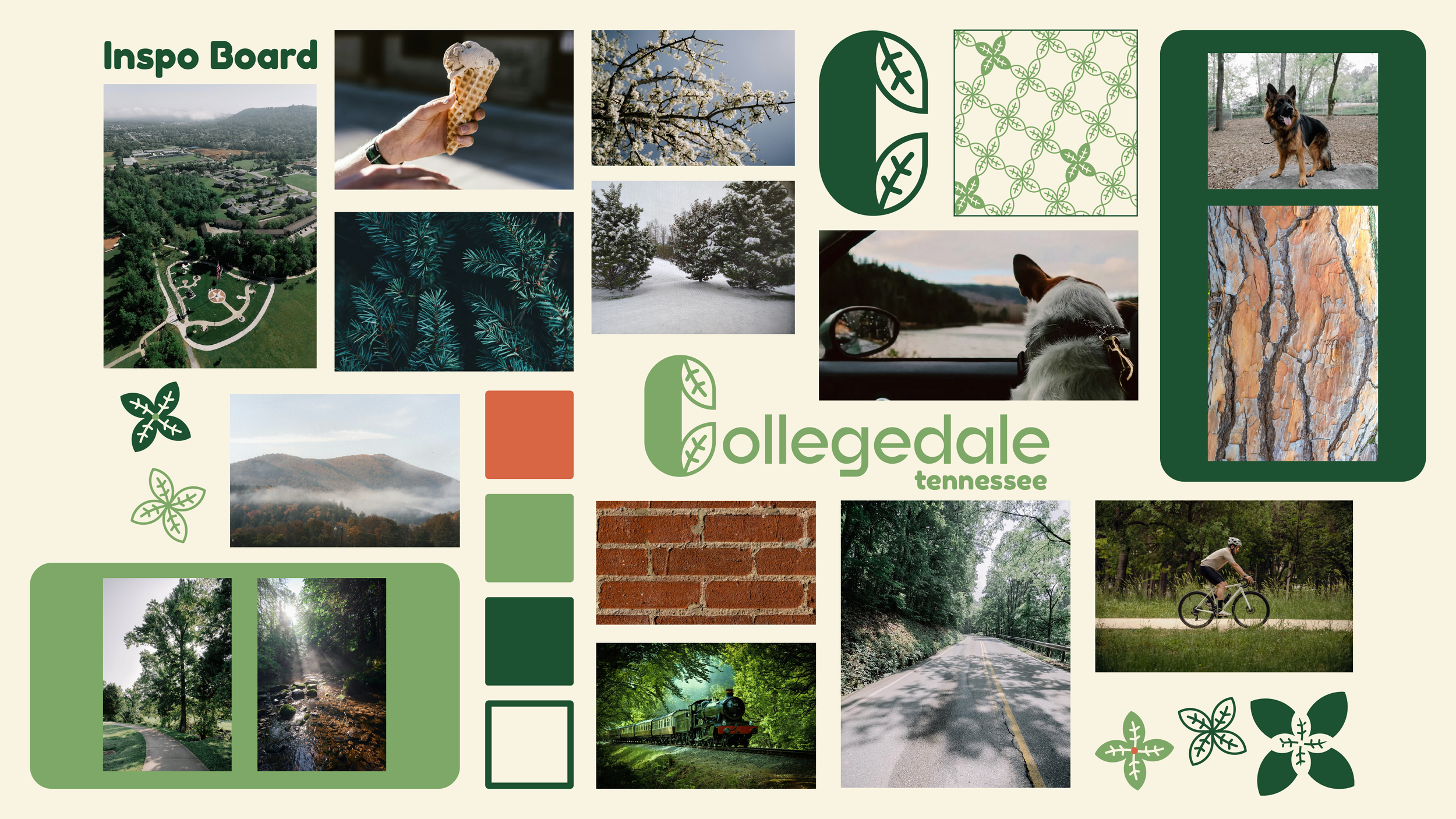
Nestled in the valley of Wolftever creek, the city of Collegedale has 6 different parks, farmer's and artisan markets, and a strong feeling of a community that’s growing together, this is what inspired my submission.
The leaf iconography incorporated into the letter C highlights the beauty of our city. A leaf is part of the whole tree, in the same way that each resident of Collegedale is part of the whole of our city.
The color palette was taken from the history of Tennessee and nature found throughout the city that connects us to the rest of the community at large. Tennessee Gold was inspired by the crystalline rock known as chert commonly found in this region, while Greenway was inspired by the beautiful trail that connects Collegedale with the city of Chattanooga.
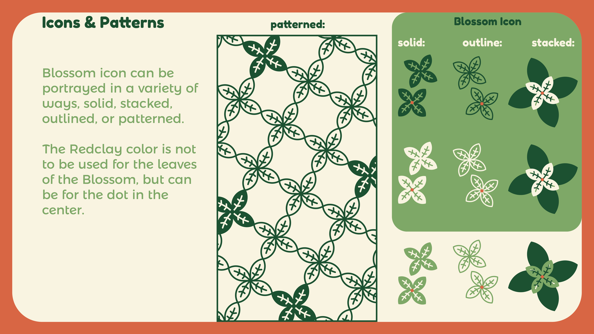
I created the Blossom icon and pattern imagery, to emphasize Collegedale’s value for community pride and safety, and demonstrates how we are all connected to each other.
One major factor I considered when designing was ensuring the brand for Collegedale wasn’t confused in any way with the recent rebrand for Chattanooga as the first Park City in the US while also emphasizing the natural landscape. I wanted the Collegedale brand to stand on its own but also feel comfortable next to the Chattanooga brand. This brand design accomplishes that, while also letting the personality of Collegedale shine through.
In the almost 14 years I’ve lived in Collegedale, I have seen this city change in ways both big and small, but the heart of the community remains the same. Collegedale is a beautiful, welcoming place to call home, with a sense of connection and emphasis on valuing our neighbor. The city takes pride in its residents the same way they take pride in our city.


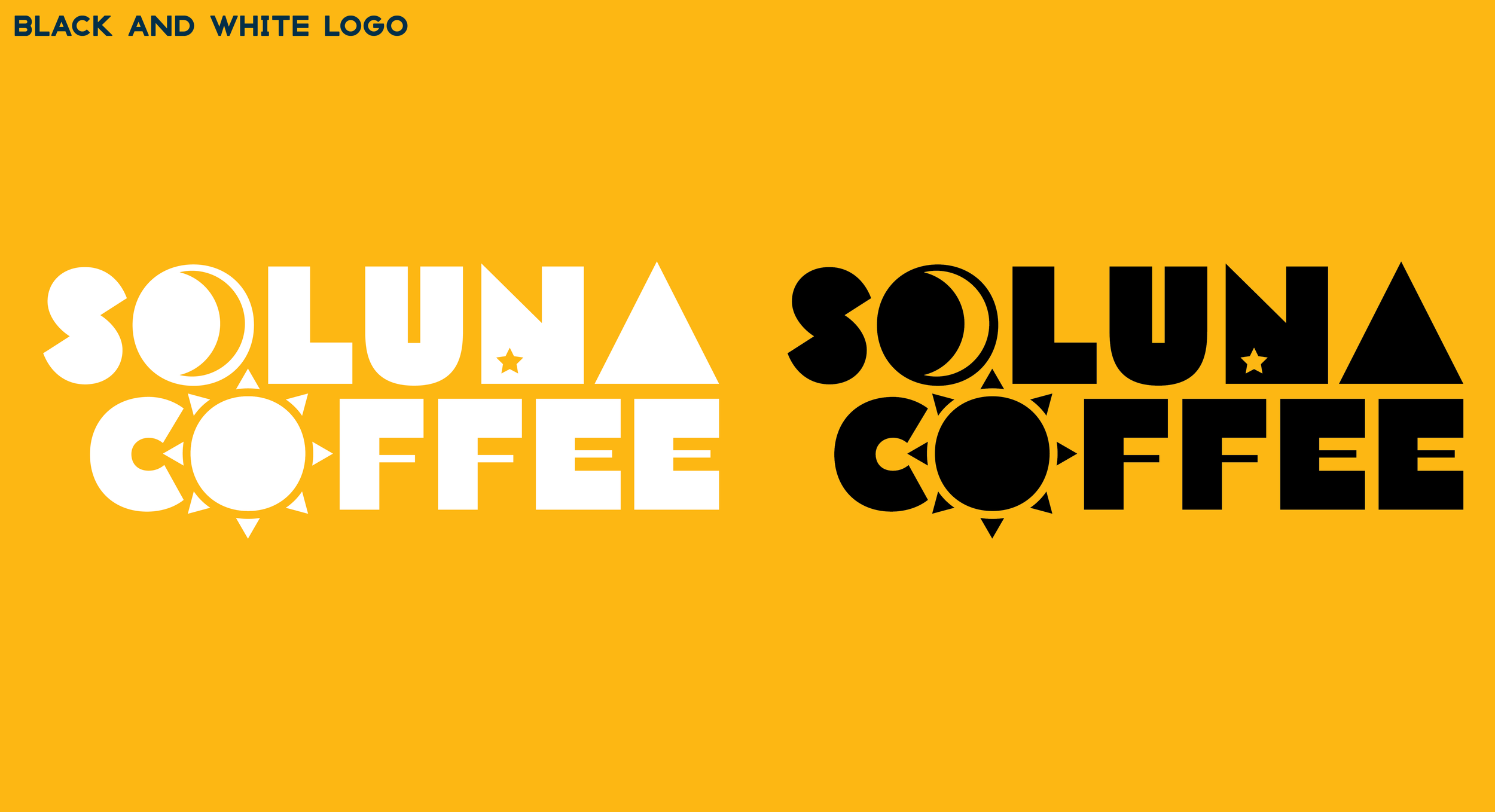
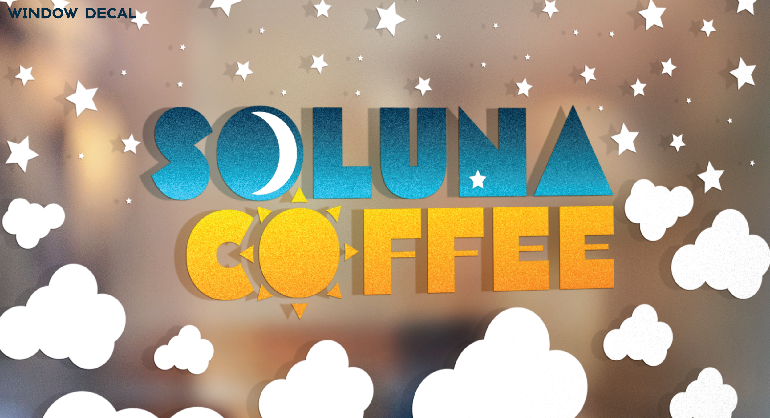
Soluna Coffee
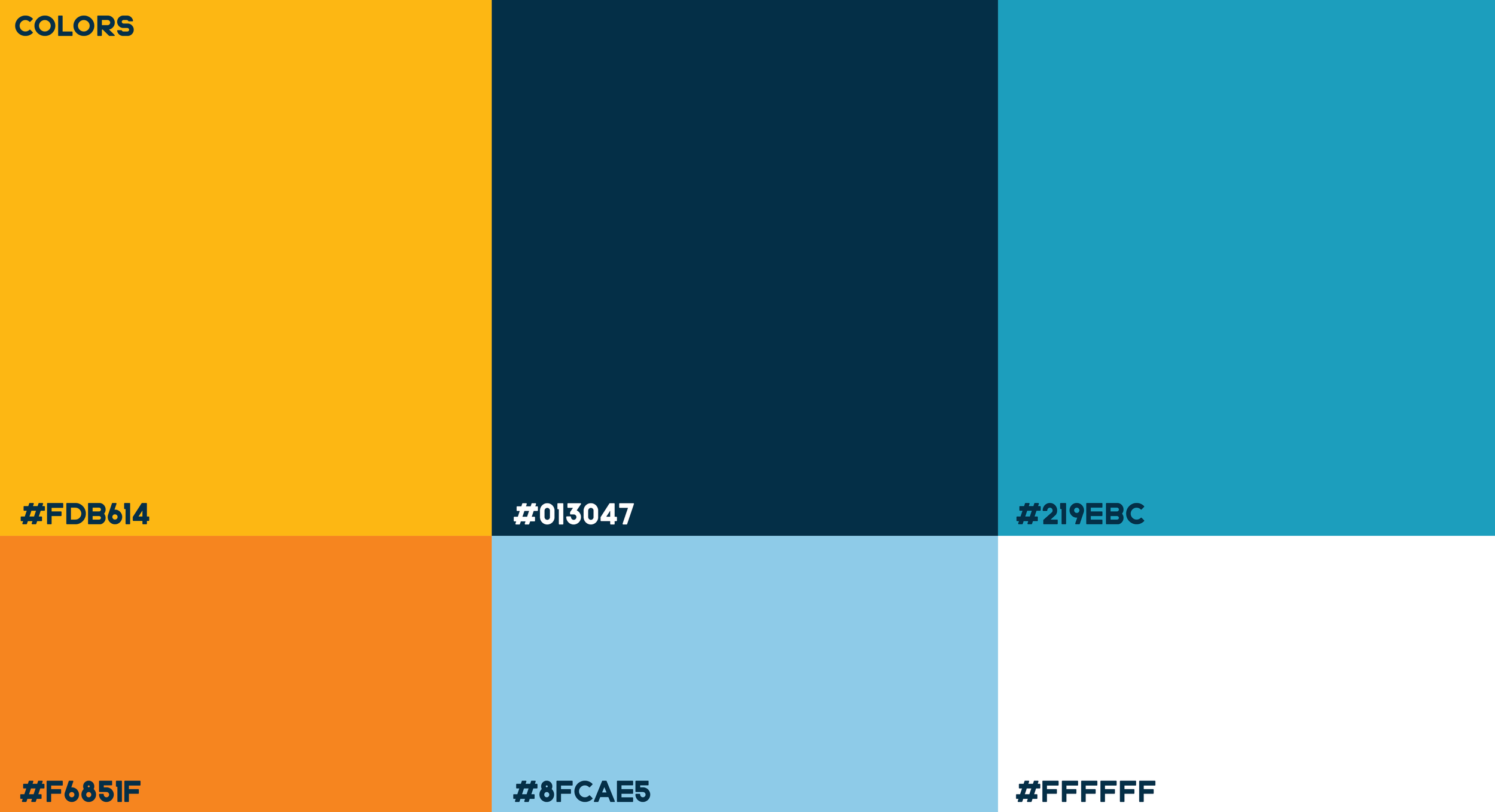
Soluna Coffee was originally pitched as a rebrand for a coffee company. while it was not the selected design, I refined it into it’s own brand called Soluna Coffee. A play on of the words “sol” and “Luna” combined with the sun and moon motif imagery. The colors play on sunrise/Sunset.
Soluna Coffee is a 24/7 coffee café with wifi and workstations, perfect for any time, day or night. Soluna Coffee’s demographic is college students studying for finals, start ups working all hours, and those early birds or night owls heading to work.


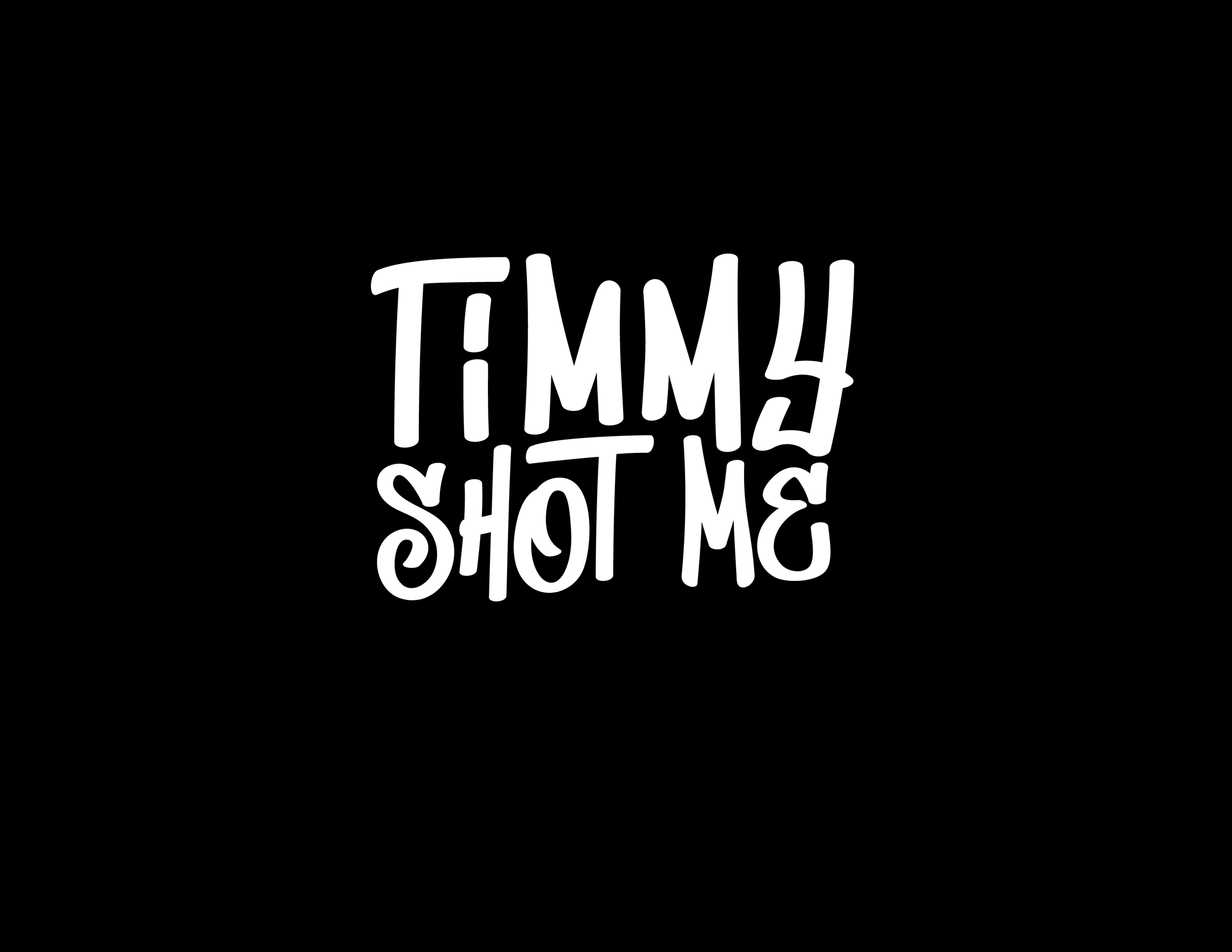
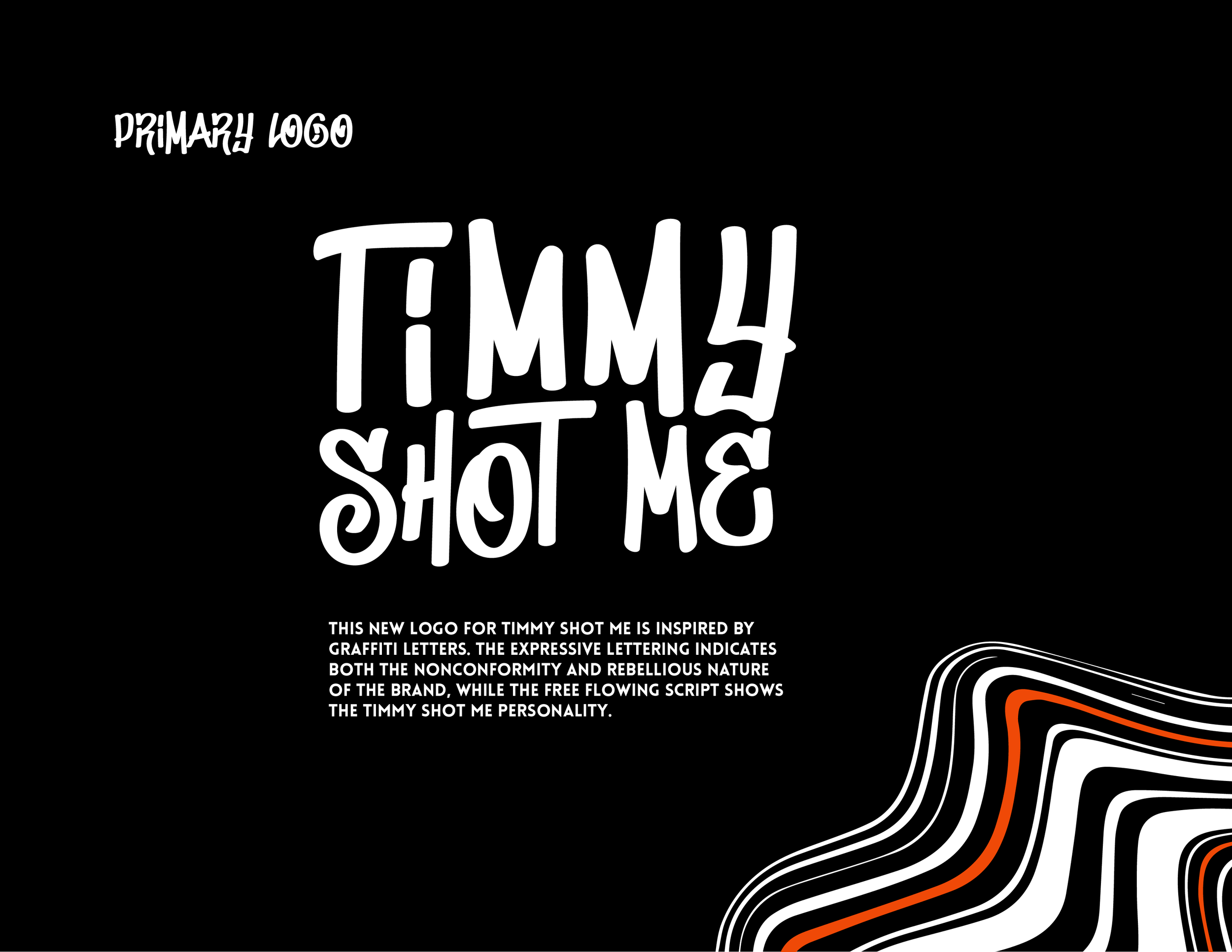
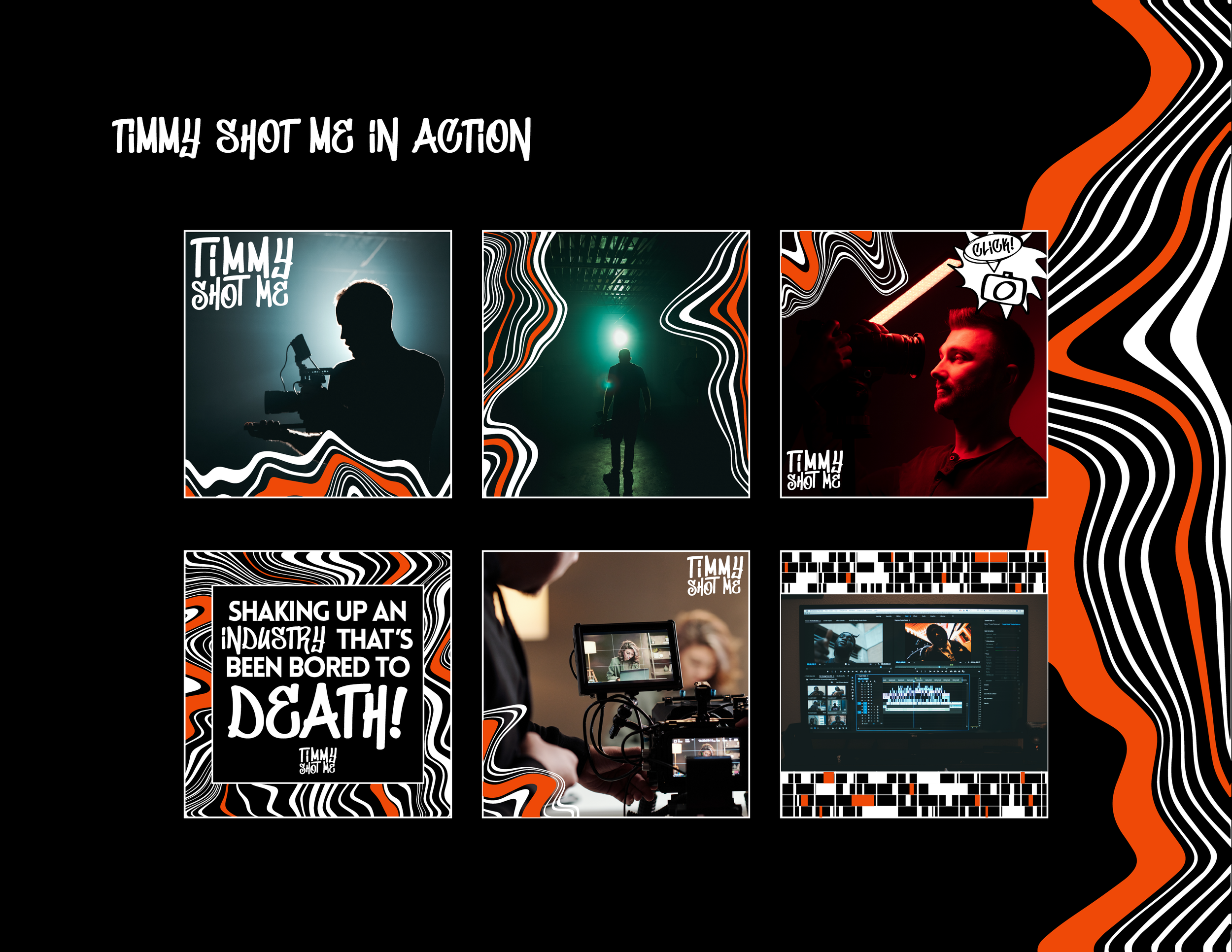
Timmy Shot Me
This rebrand was created during the Brand Identity Design course by Made By James in 2024 for a media production company called Timmy Shot Me. This is the rebrand pitch deck I made for the class. Special thank to Timmy for allowing the class to use his company for our rebrand project!


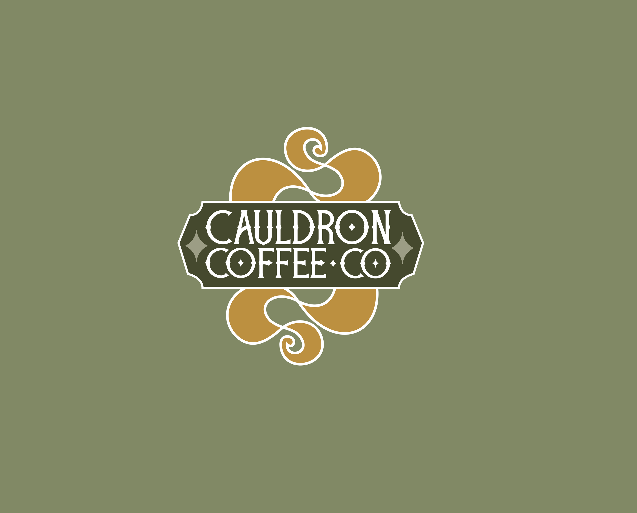
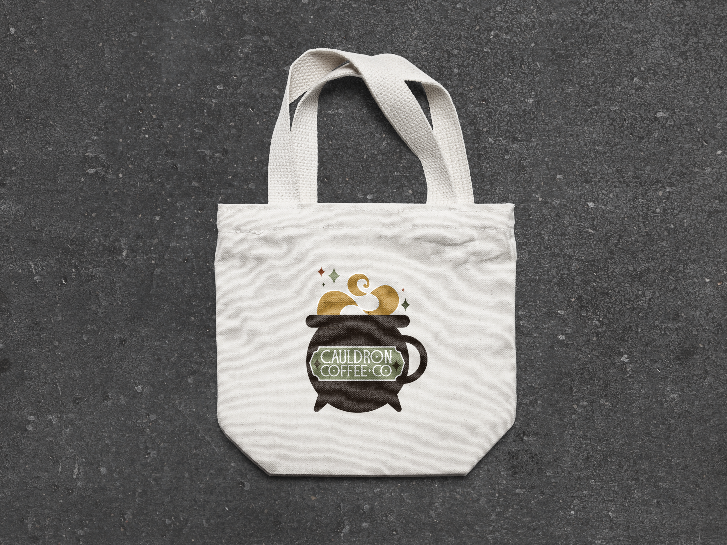
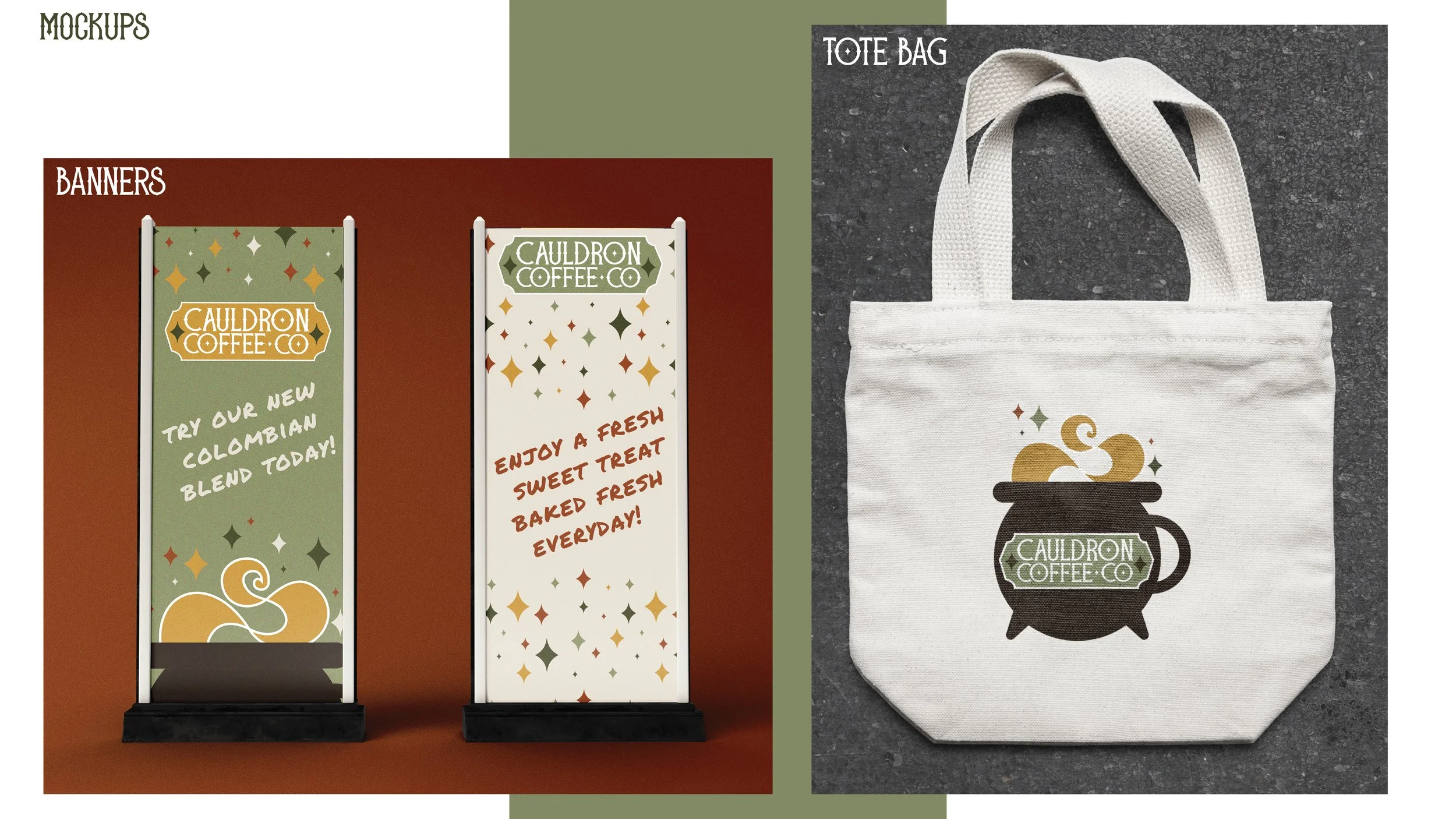
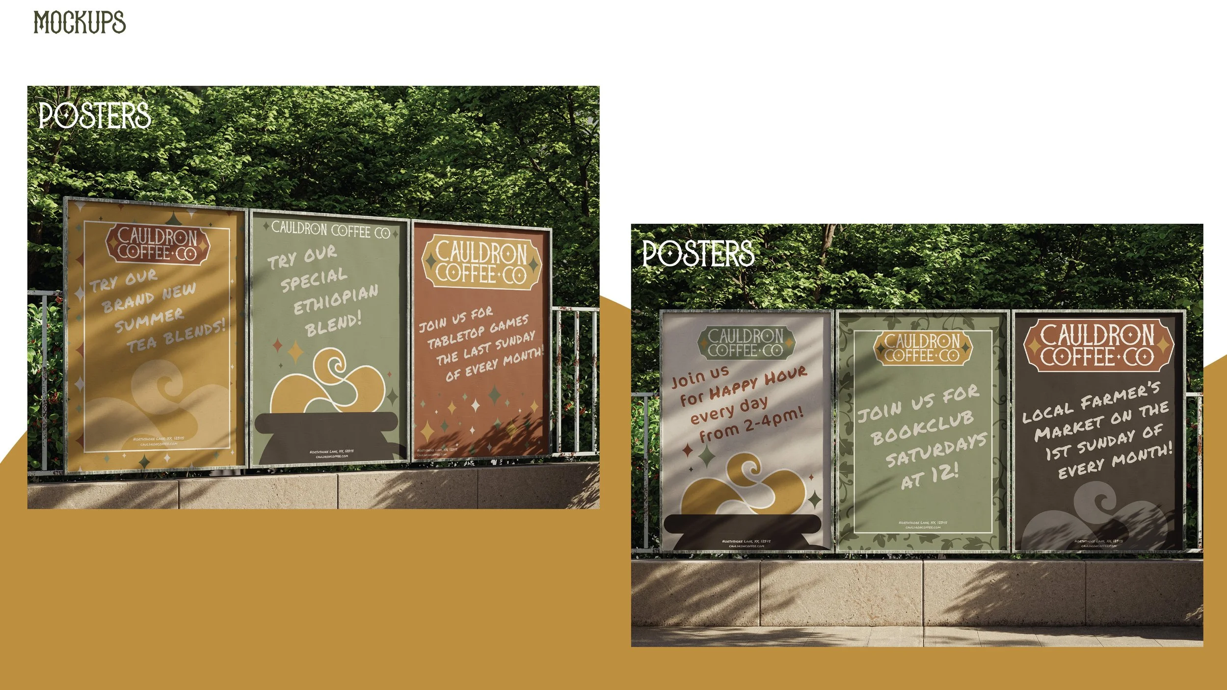
Cauldron Coffee
CAULDRON COFFEE CO, created in 2024 as PERSONAL BRANDING PROJECT was inspired by the concept of the “third place”. third places are social environments separate from home and work, examples of third spaces include libraries, bookstores, churches, cafes, and gyms. These are places where the community can gather for fellowship and connection.
The idea behind Cauldron Coffee Co was to reclaim a space neglected by time and lack of community, and turn it into a Third Place, to create an atmosphere of connection, spiritualism, sustainability, and slow life down.


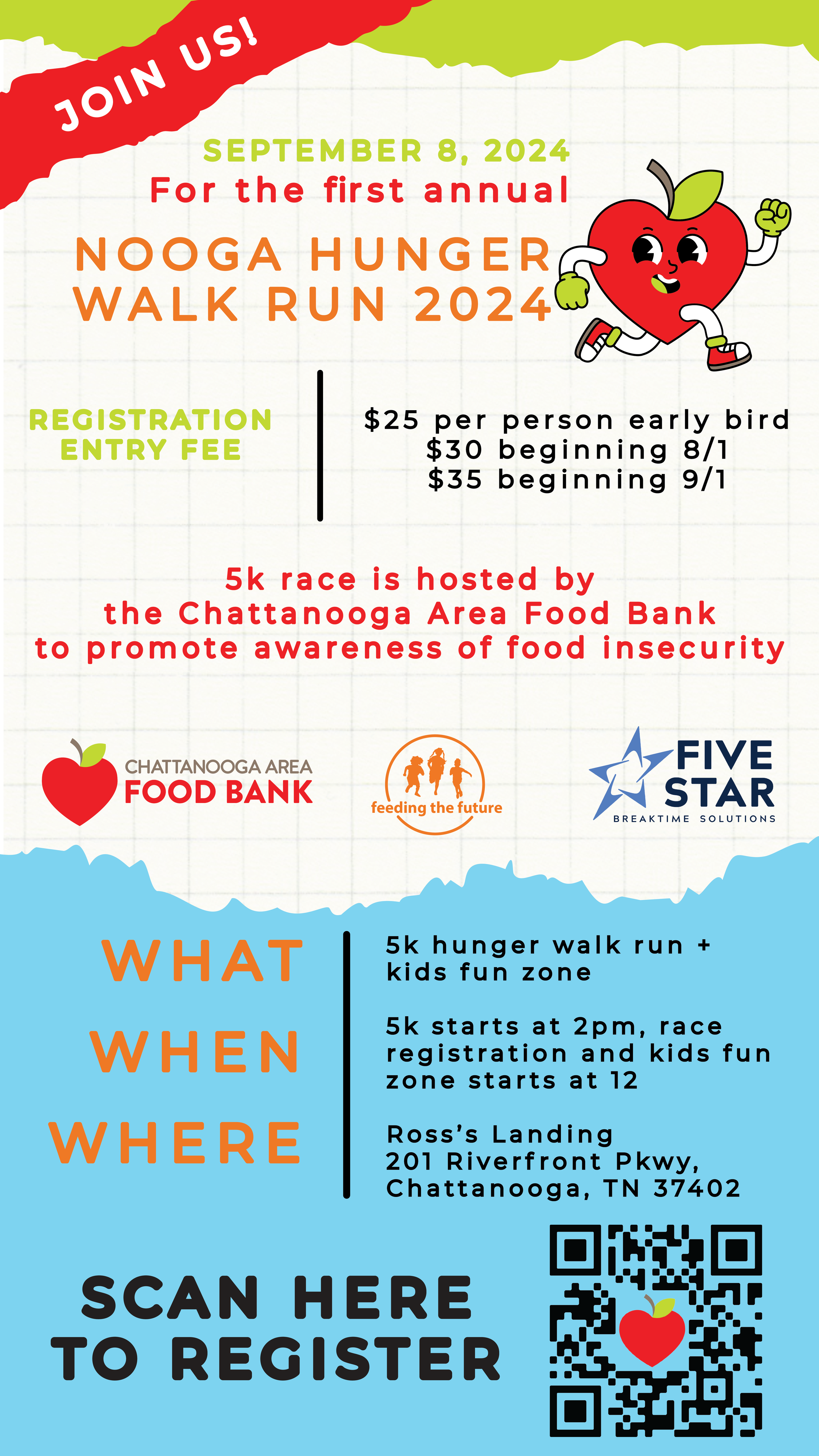
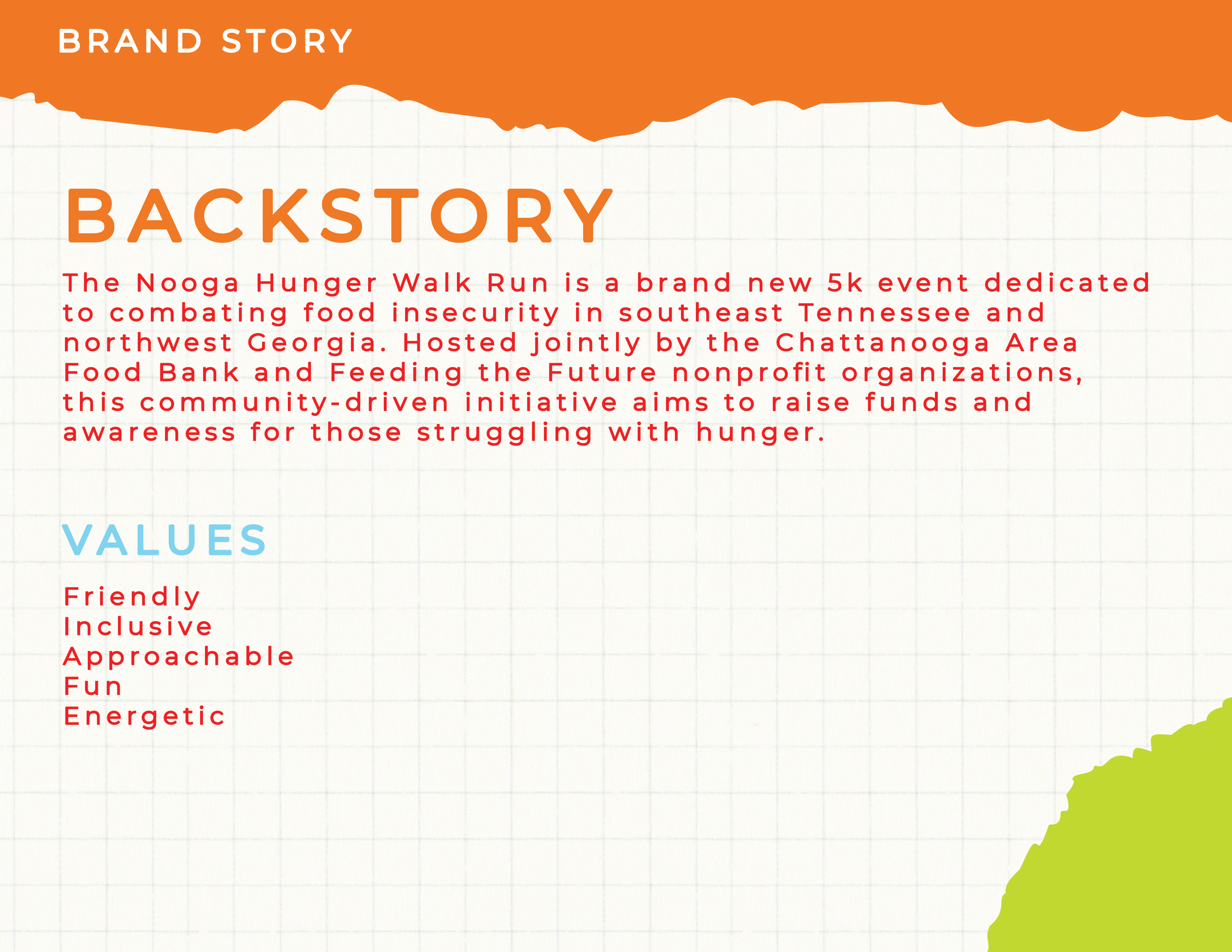
Nooga Hunger Walk Run
created in 2024 for the Chattanooga Area Food Bank nonprofit and jointly partnered with the Feeding the Future nonprofit for the first annual Walk-Run event to raise awareness for those struggling with food insecurity within their local community of southeast Tennessee and Northwest Georgia.
The Nooga Hunger Walk Run is a family friendly 5k hosted in Chattanooga, Tennessee. in 2024, the event raised almost $80,000 in sponsorships, ticket sales and donations.


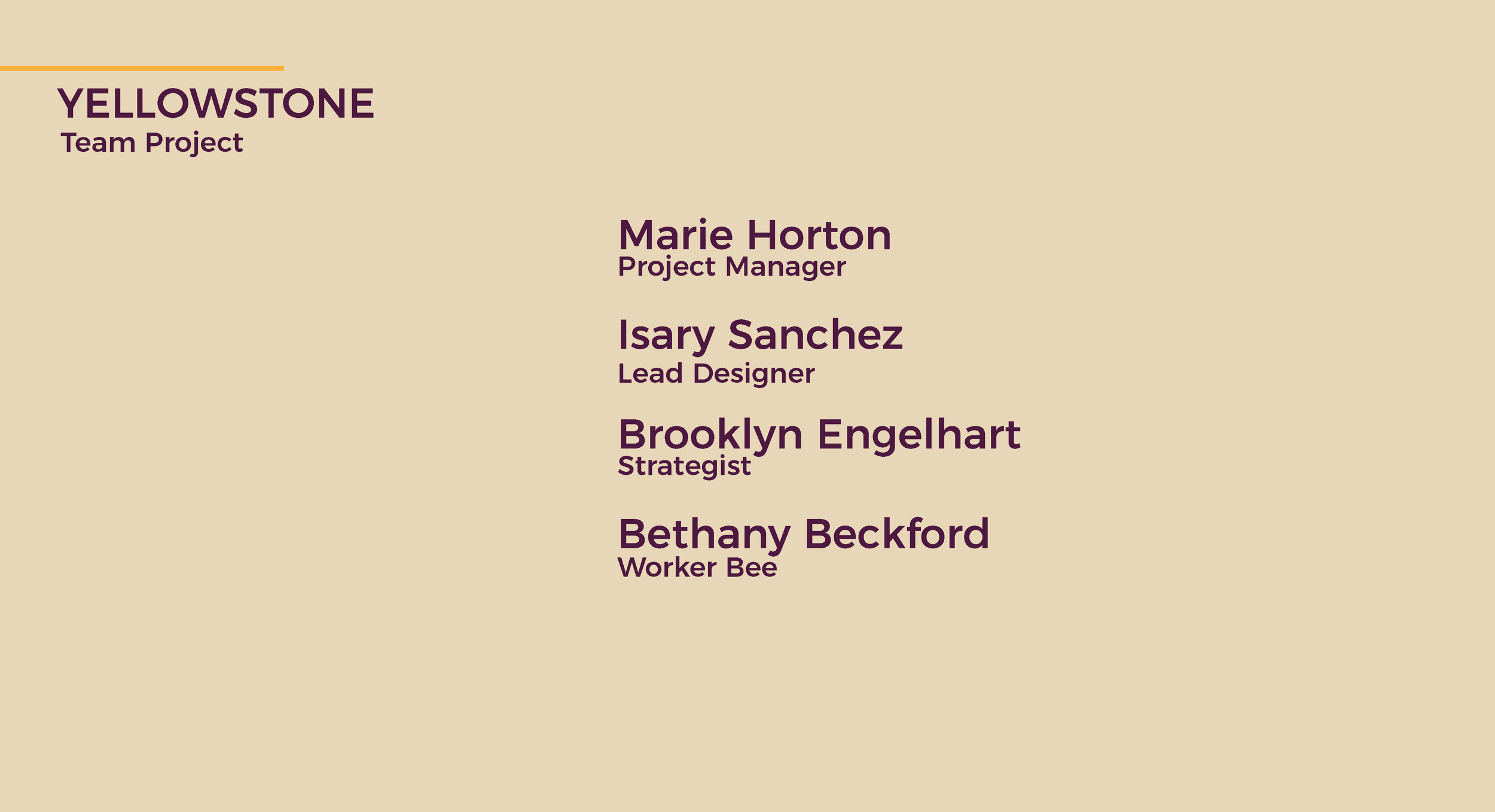
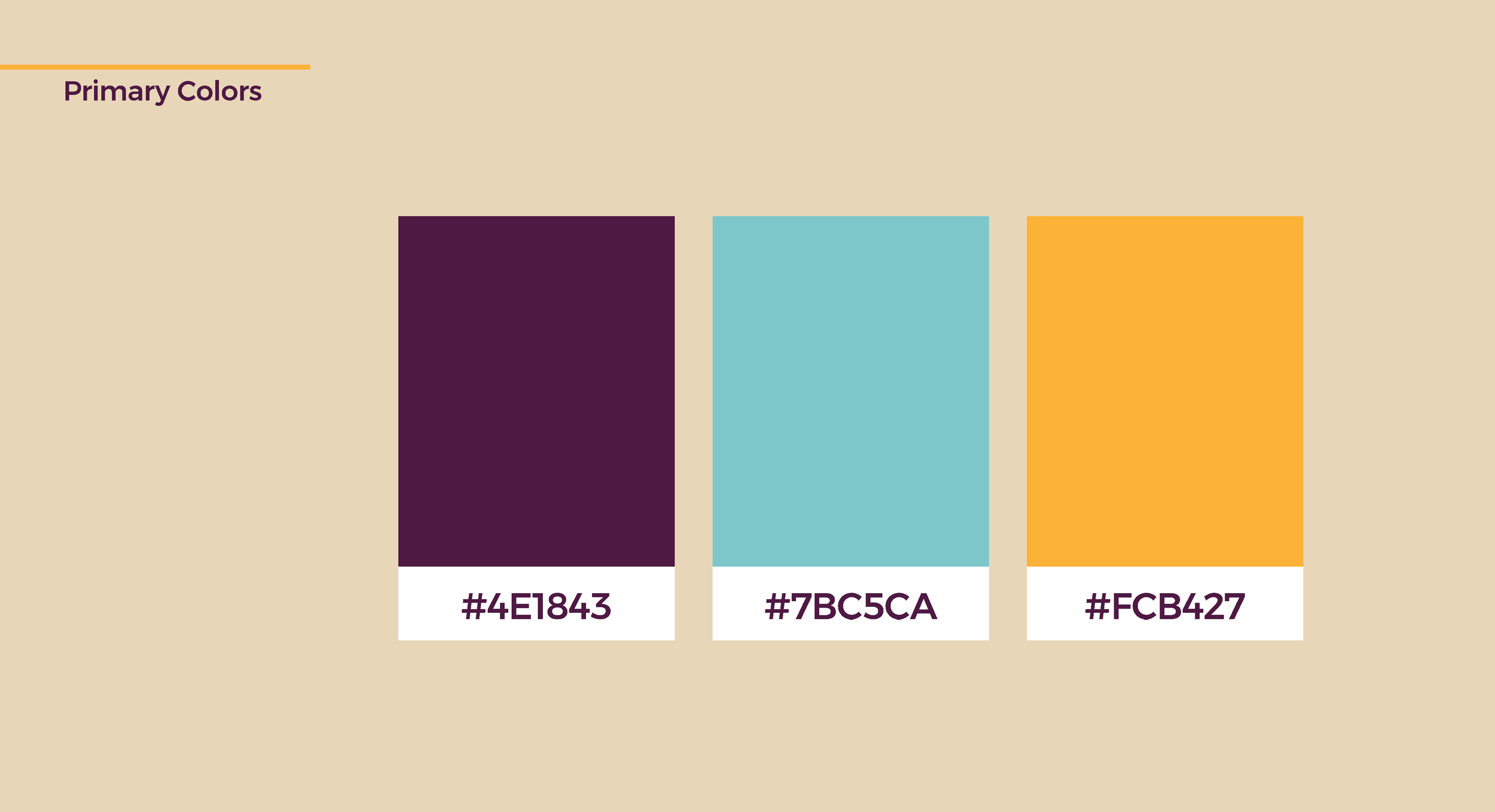
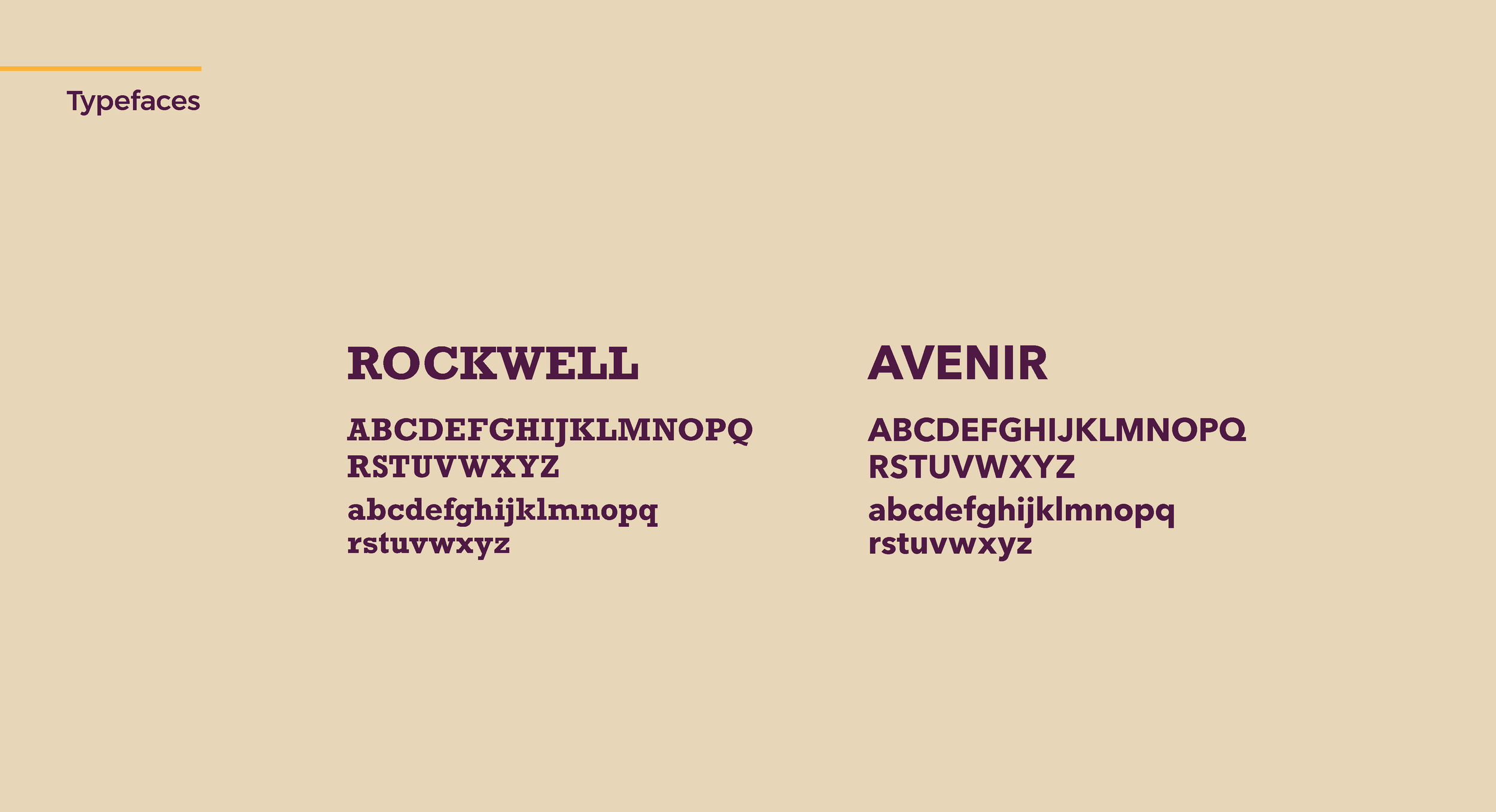
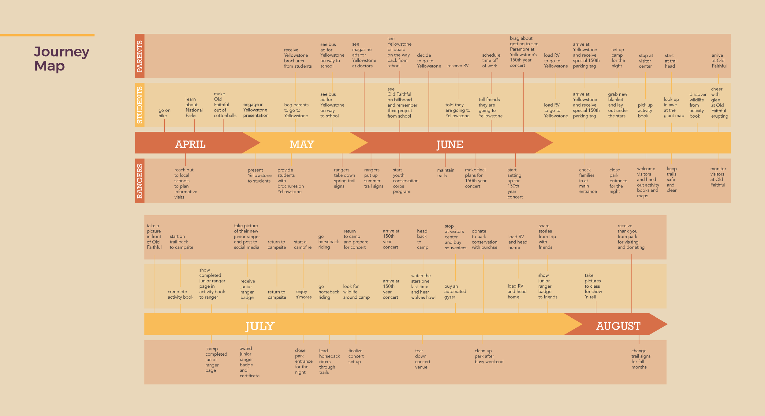
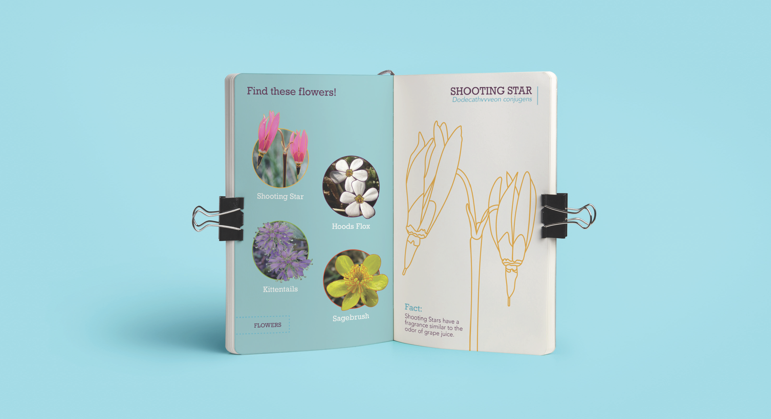
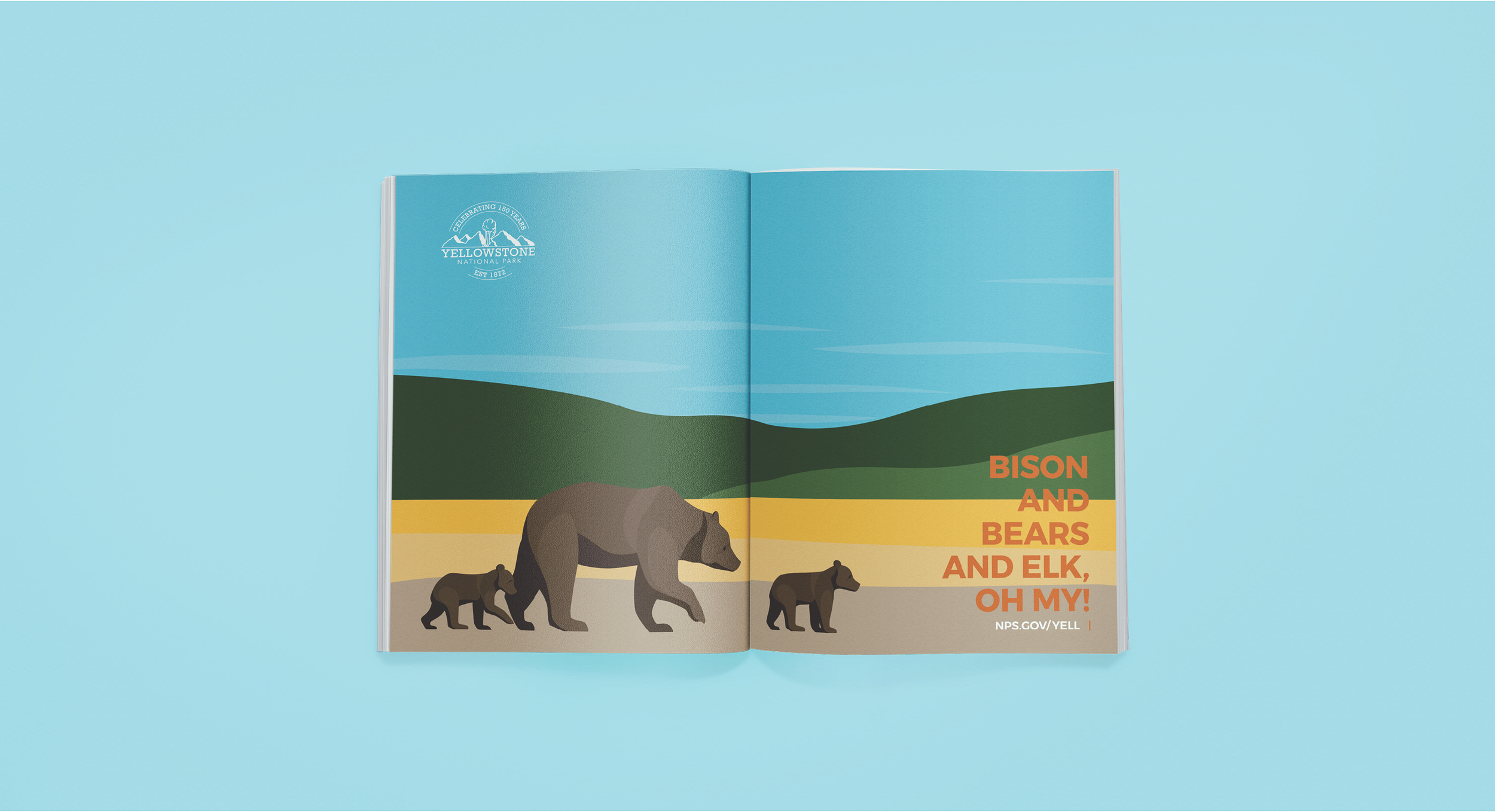
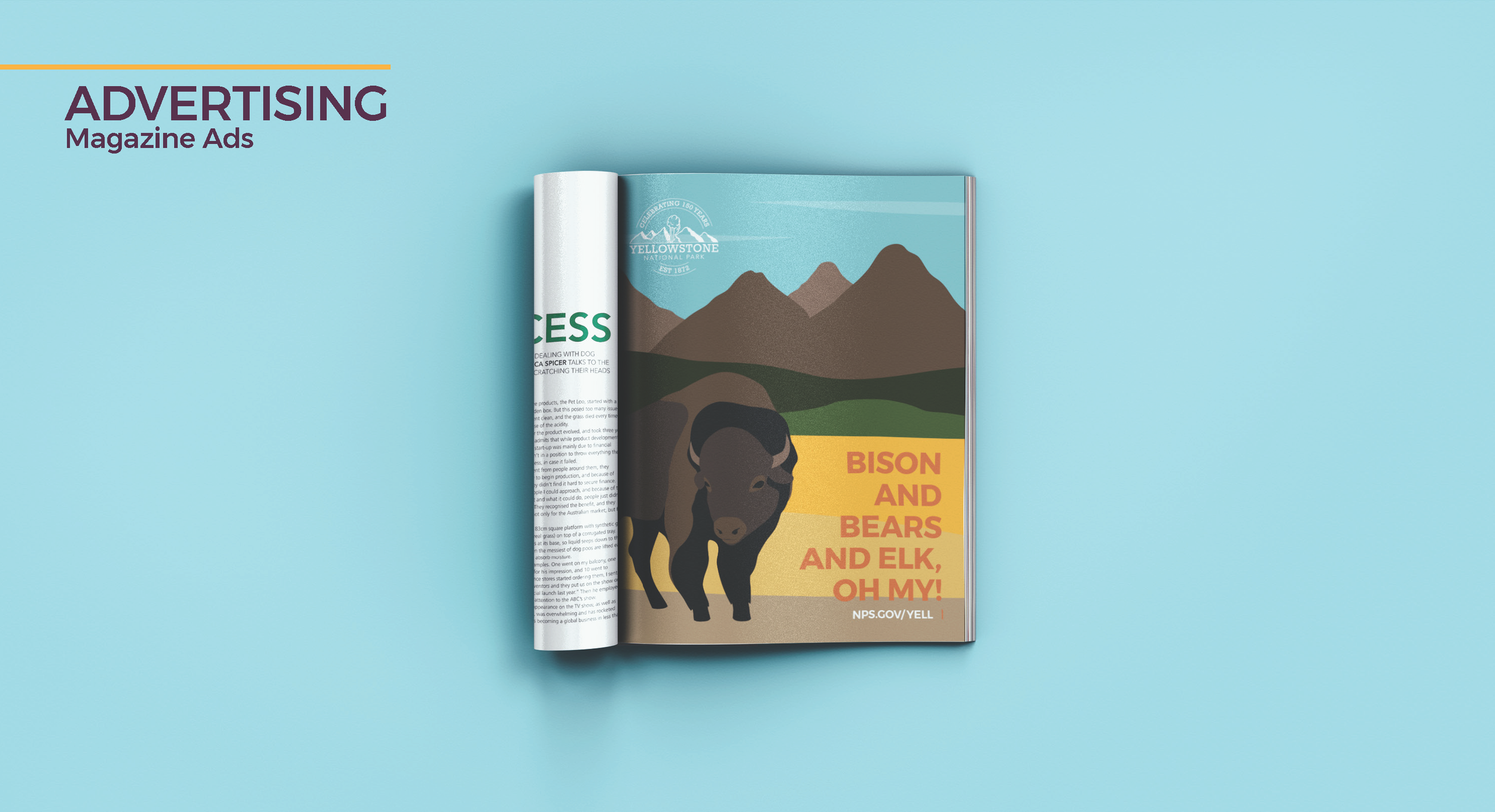
Yellowstone 50th anniversary
for this group project, marie managed a team of three other designers to create this conceptual rebrand for Yellowstone National Park featuring a celebratory night of music festival for Yellowstone’s 50th anniversary.
her responsibilities included assigning roles and assets to the team, creating asset timeline, scheduling check in meetings, assisting with design where needed, and presenting final project.